Introduction
A few weeks ago I created my own version of an ad that had to fit in with a certain ad campaign. The ad campaign that I chose was a Nike campaign.

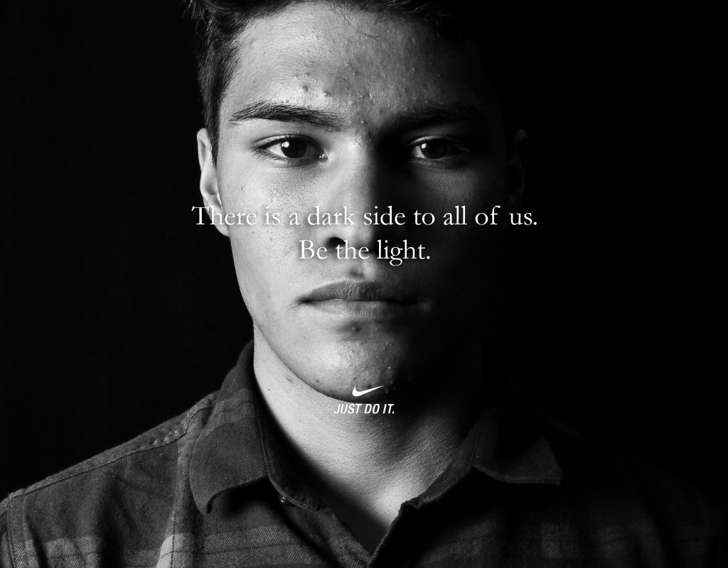
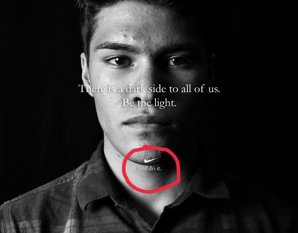
This is one of the original ads from Nike. I chose it because it is my style. I am not a flashy guy when it comes to dressing up or going out. I am more reserved, but classy. This ad does a good job of looking good, but not being extravagant. It has simple design principles, but they work well. If you want to learn more about the ad campaign you can check it out here.
Analysis
First off, one of the most important design principles in this campaign was the use of contrast in the photo. Its a black and white photo, so contrast is what makes this image look good. There are no distracting grey areas. The subject is clear and the contrast of his shirt and hair make him stand out.
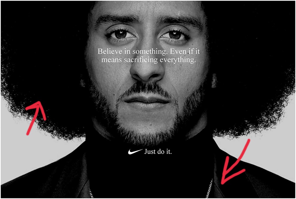
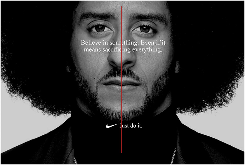
Secondly, the use of alignment in the campaign fits in with the slogan “Just do it.” The body copy is centered, focused, and serious. Often times centered text makes designs look soft, but here it looks serious. It’s also worth noting that the model is centered with the text and his face is nearly asymmetrical.
The proximity of the text is simple. There is body copy and then there is the slogan. There is not much contrast between the typeface, so the proximity was necessary to separate them. That way people know that the body copy is the body copy and that the slogan is the slogan. The proximity of the model to the camera is also something that works well. There isn’t too much white space. It’s just right.
Repetition is not noticeable in this particular ad, but it is very relevant because if you take a look at the other ads from this campaign, then you would see how repetition is at work. Each ad has centered text and each one followed up by the company slogan: “Just do it”. It connects this whole ad campaign together in such a simple way, but when you see it, you just know its Nike.
Colors in this image are just black and white. The creator of the image did a great job of contrasting the black and white colors to emphasize the subject’s face. He also did a good job of getting rid of distracting grey color which could have taken away from the image. The white text was a great choice as well since it contrasts well with the background.
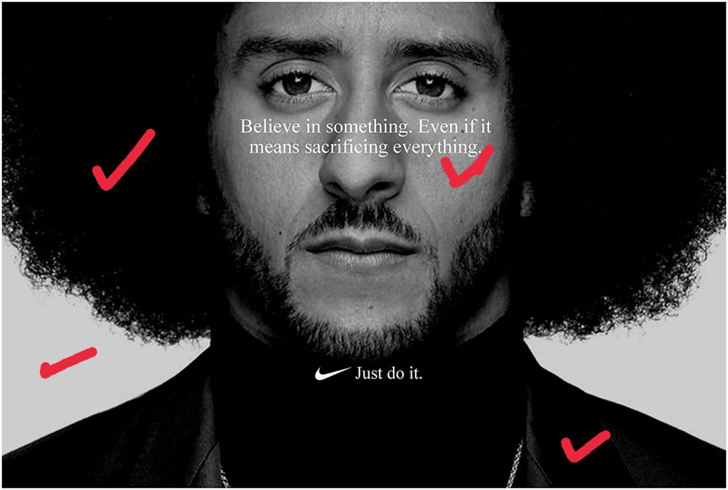
Lastly we have typography. Nike went with a simple, but serious text that looks like Times New Roman or a similar old style serif font. It portrays the message well and effectively. The centered text also gives it a more serious look.
New Ad Analysis
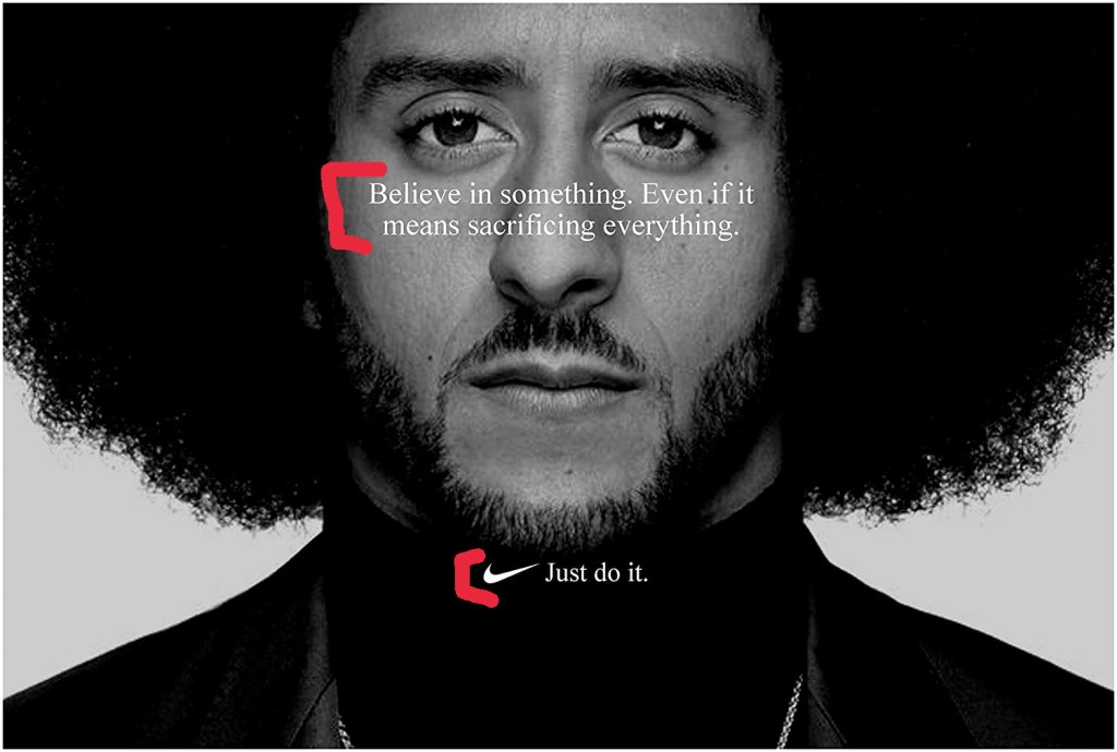
Starting off with contrast in my creation of this ad, I used a black and white image with serious tone to convey the message clearly.
Similar to the original ad, I centered my text and I also centered the Nike logo / slogan. Alignment for this ad was simple, but effective.
For proximity I cropped the photo a bit so that the model seemed closed and replicated the effect of the original ad. I also made sure that the slogan and the body copy were separate.

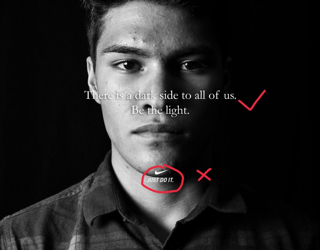
Repetition for this was not really present except for the fact that my image could fit in to the ad campaign. One thing I noticed after creating this ad was that the Nike logo that I used did not have the times new roman font, so if you’re doing a similar project, make sure to double check every detail!
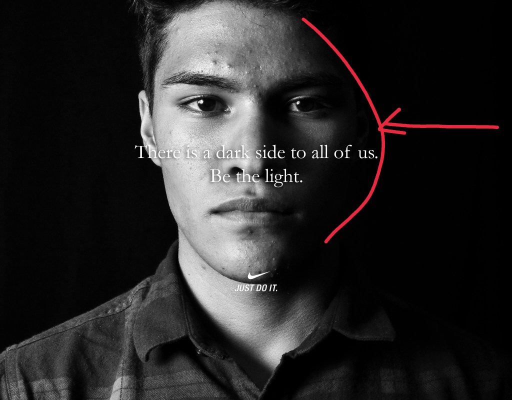
Similar to the original, color is not present in my image except for the black and white which is mostly contrast. One thing that makes my photo a bit more serious in my opinion is the dark shadow coming in from the model’s left side. This helps present the message better to the viewer.
Lastly, the typography in this ad is simple. Again, I overlooked the text for the Nike logo, but it is an easy fix. Just use a layer mask to remove the “Just do it” text and then replace it with a times new roman or similar font. I also added a dropshadow to my text to make it stand out a bit from the background.
Conclusion
The original ad is obviously a better quality than my ad, but my ad has all of the same qualities of the original. From design to typography. It is simple, but serious and effective. The message is clear and powerful.

/cdn.vox-cdn.com/uploads/chorus_asset/file/14448606/Ibtiha__Muhammad_IG_FEED_85640.jpg)
/cdn.vox-cdn.com/uploads/chorus_asset/file/14448800/Serena_Williams_Twitter_85680.jpg)