Be yourself; Everyone else is already taken.
— Oscar Wilde.
This is the first post on my new blog. I’m just getting this new blog going, so stay tuned for more. Subscribe below to get notified when I post new updates.
Be yourself; Everyone else is already taken.
— Oscar Wilde.
This is the first post on my new blog. I’m just getting this new blog going, so stay tuned for more. Subscribe below to get notified when I post new updates.
A few weeks ago I created my own version of an ad that had to fit in with a certain ad campaign. The ad campaign that I chose was a Nike campaign.

This is one of the original ads from Nike. I chose it because it is my style. I am not a flashy guy when it comes to dressing up or going out. I am more reserved, but classy. This ad does a good job of looking good, but not being extravagant. It has simple design principles, but they work well. If you want to learn more about the ad campaign you can check it out here.
First off, one of the most important design principles in this campaign was the use of contrast in the photo. Its a black and white photo, so contrast is what makes this image look good. There are no distracting grey areas. The subject is clear and the contrast of his shirt and hair make him stand out.
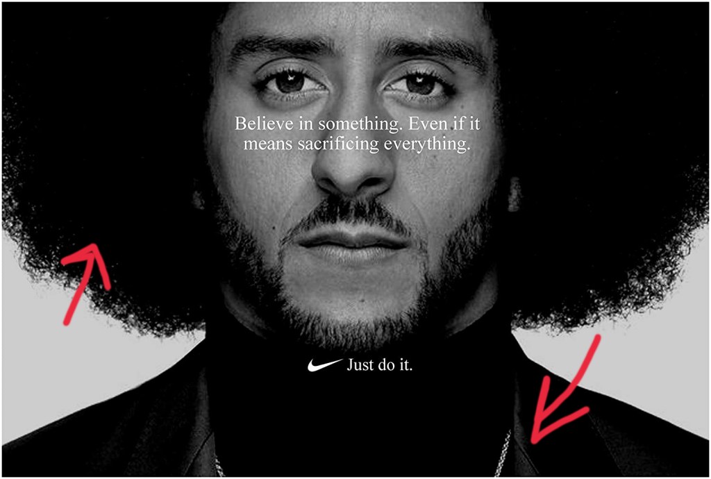
Secondly, the use of alignment in the campaign fits in with the slogan “Just do it.” The body copy is centered, focused, and serious. Often times centered text makes designs look soft, but here it looks serious. It’s also worth noting that the model is centered with the text and his face is nearly asymmetrical.
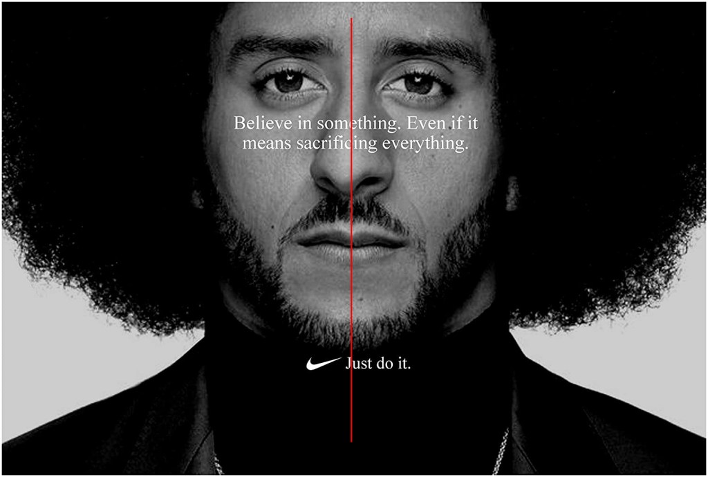
The proximity of the text is simple. There is body copy and then there is the slogan. There is not much contrast between the typeface, so the proximity was necessary to separate them. That way people know that the body copy is the body copy and that the slogan is the slogan. The proximity of the model to the camera is also something that works well. There isn’t too much white space. It’s just right.
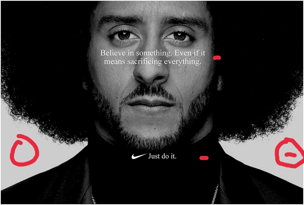
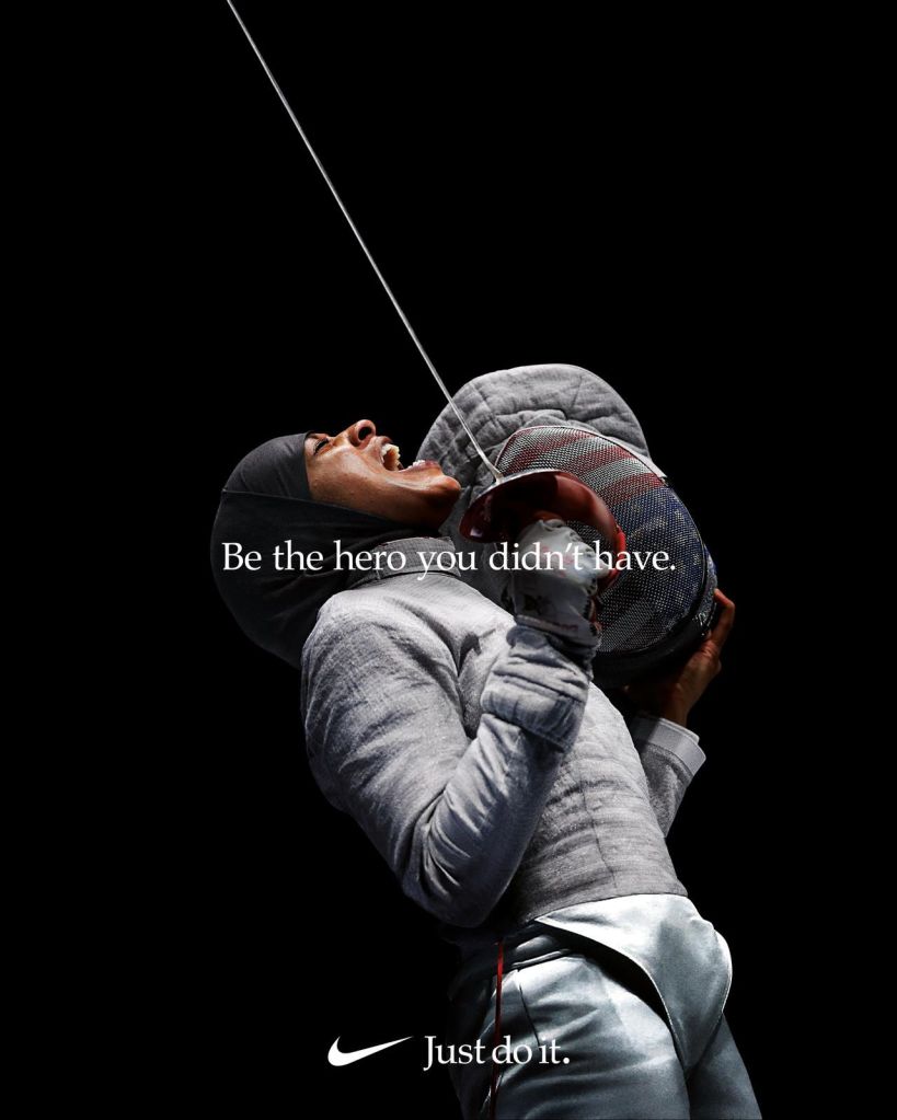
Repetition is not noticeable in this particular ad, but it is very relevant because if you take a look at the other ads from this campaign, then you would see how repetition is at work. Each ad has centered text and each one followed up by the company slogan: “Just do it”. It connects this whole ad campaign together in such a simple way, but when you see it, you just know its Nike.
Colors in this image are just black and white. The creator of the image did a great job of contrasting the black and white colors to emphasize the subject’s face. He also did a good job of getting rid of distracting grey color which could have taken away from the image. The white text was a great choice as well since it contrasts well with the background.
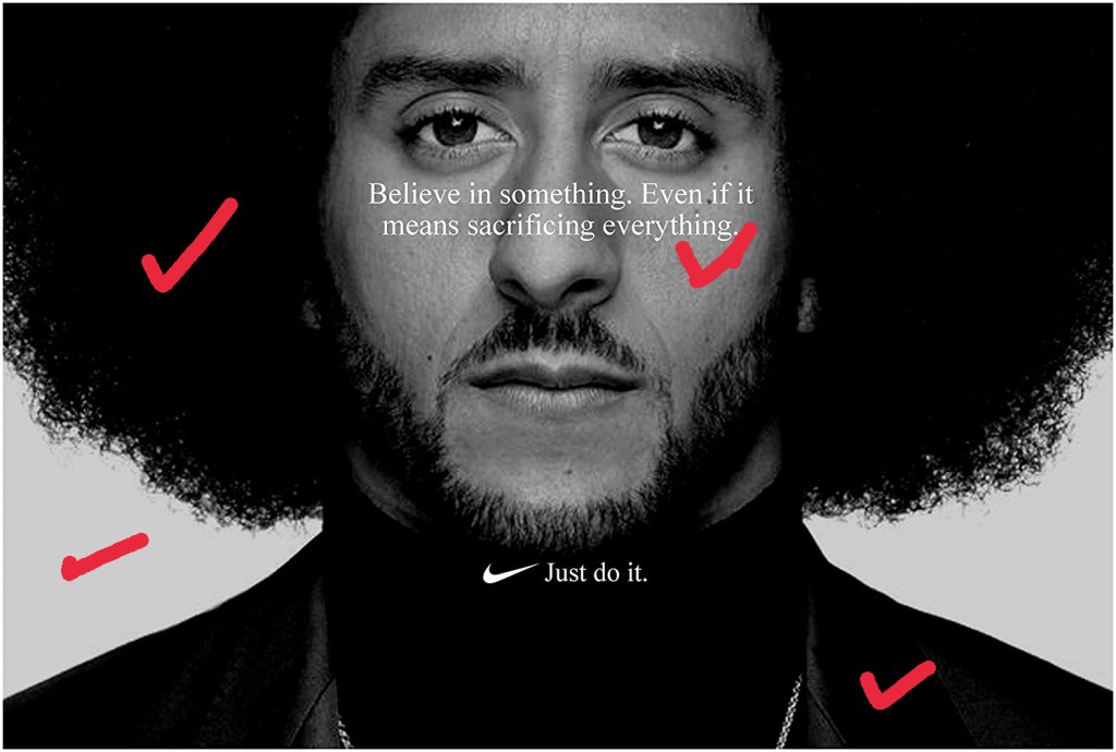
Lastly we have typography. Nike went with a simple, but serious text that looks like Times New Roman or a similar old style serif font. It portrays the message well and effectively. The centered text also gives it a more serious look.
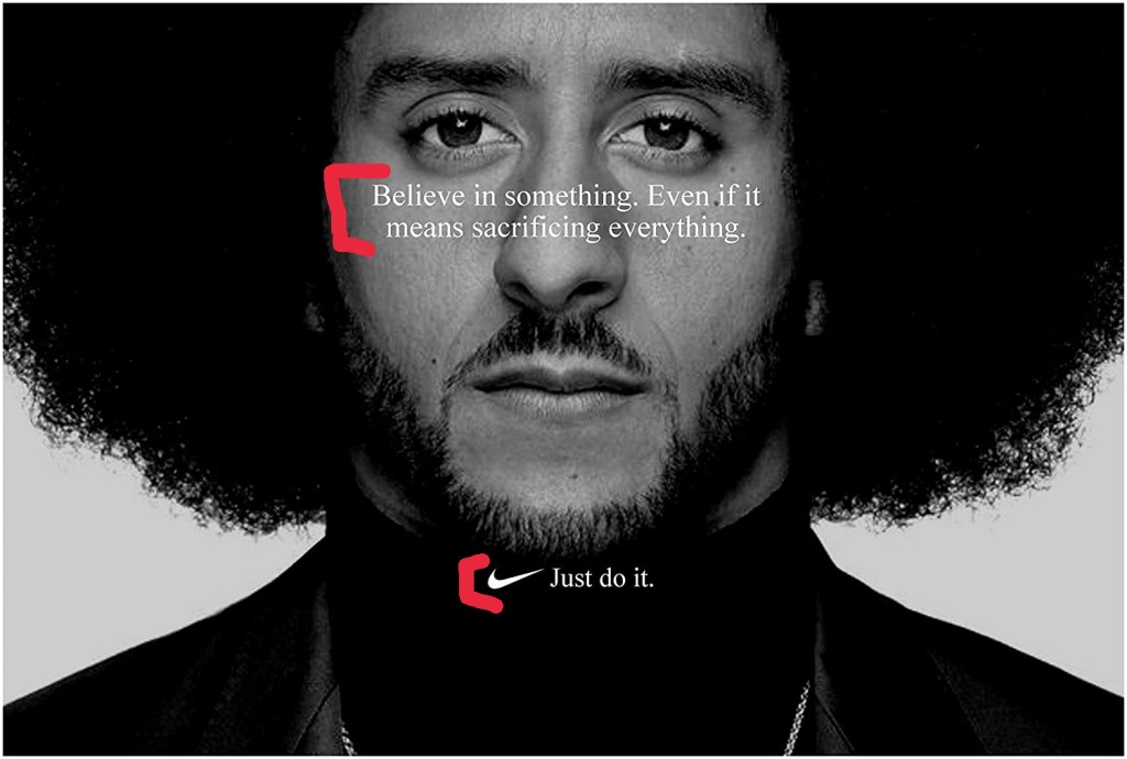
Starting off with contrast in my creation of this ad, I used a black and white image with serious tone to convey the message clearly.
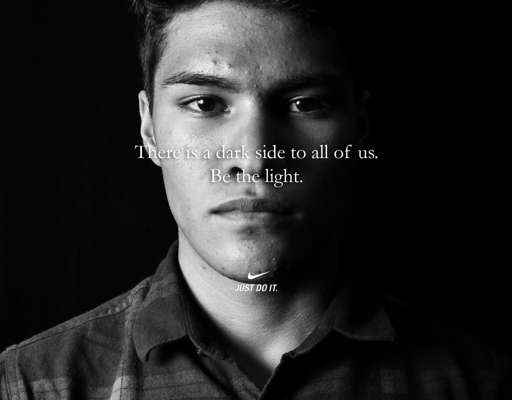
Similar to the original ad, I centered my text and I also centered the Nike logo / slogan. Alignment for this ad was simple, but effective.
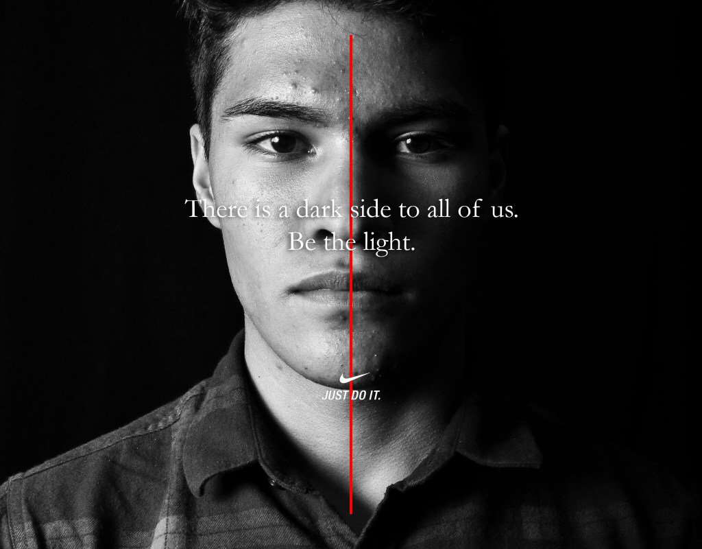
For proximity I cropped the photo a bit so that the model seemed closed and replicated the effect of the original ad. I also made sure that the slogan and the body copy were separate.

Repetition for this was not really present except for the fact that my image could fit in to the ad campaign. One thing I noticed after creating this ad was that the Nike logo that I used did not have the times new roman font, so if you’re doing a similar project, make sure to double check every detail!
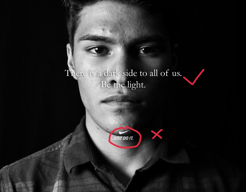
Similar to the original, color is not present in my image except for the black and white which is mostly contrast. One thing that makes my photo a bit more serious in my opinion is the dark shadow coming in from the model’s left side. This helps present the message better to the viewer.
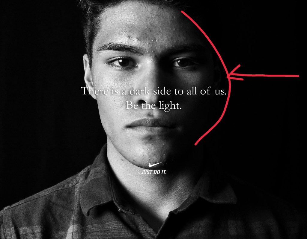
Lastly, the typography in this ad is simple. Again, I overlooked the text for the Nike logo, but it is an easy fix. Just use a layer mask to remove the “Just do it” text and then replace it with a times new roman or similar font. I also added a dropshadow to my text to make it stand out a bit from the background.
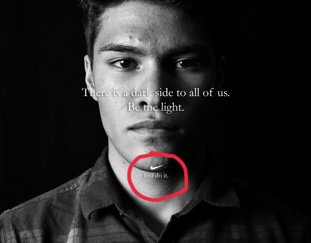
The original ad is obviously a better quality than my ad, but my ad has all of the same qualities of the original. From design to typography. It is simple, but serious and effective. The message is clear and powerful.
By Israel Garcia
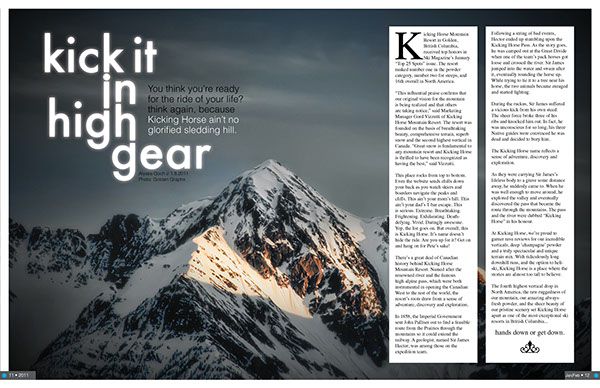
This is a magazine spread that I found on google images. It is from a magazine called
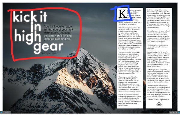
The two typefaces used in this magazine spread are Sans Serif and Slab Serif. The typeface circled in red is a Sans Serif typeface because it has no serifs. It is used as the title and brief description of the article. The Slab Serif typeface is circled in blue and it is identified as slab serif because the serifs are horizontal and there is no extreme transition in the strokes.
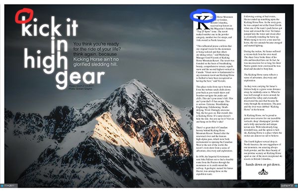
The two typefaces used in this spread are very good at contrasting each other because there is an immediate difference. The Sans Serif typeface has no serifs and the Slab Serif typeface uses serifs. Since the title and description of the article are written in Sans Serif, the reader can easily identify where the title of the article ends and where the actual article begins. It is also good that the article is written in Slab Serif because it is good for formal writing.
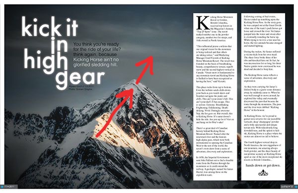
This photo does a great job of using depth of field. My eye is captured first by the sunlight hitting the mountain and then I am led further into the photo to the summit. My eye then goes to the clouds which is the background of the image. Although it could be argued that this photo uses leading lines to draw the viewer’s attention, I would argue that depth of field in this images is a stronger element here.


These are three images that I took that use the same principle of depth of field. I was not able to find a snowy mountain to take pictures of because those are kind of hard to come by in Phoenix, Arizona, but I was able to take some pretty cool landscapes that have a good depth of field. I also used the sun in my images since it is one of the things that caught my eye in the original picture. In my second picture I also used myself as a subject to catch the viewer’s eyes as a starting point.

This is an ad by Pepsi for the Super Bowl LIII that I chose because of it’s simple, yet great design qualities. I will be reverse engineering this ad to show them off.
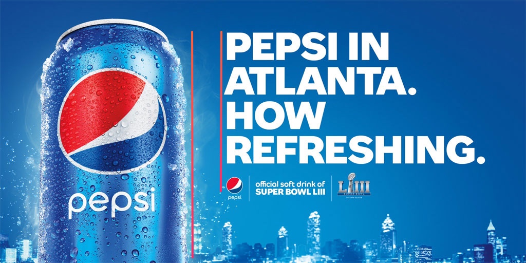
The alignment of the text on and the alignment of the Pepsi can creates an even white space making it easy on the viewer’s eyes. The text also makes their statement more bold instead of wimpy and it guide’s the viewer’s eyes down.

The repetition of the periods makes the statement more bold. Pepsi wants the reader to believe it’s refreshing and they state that clearly and without a doubt by using periods in repetition.
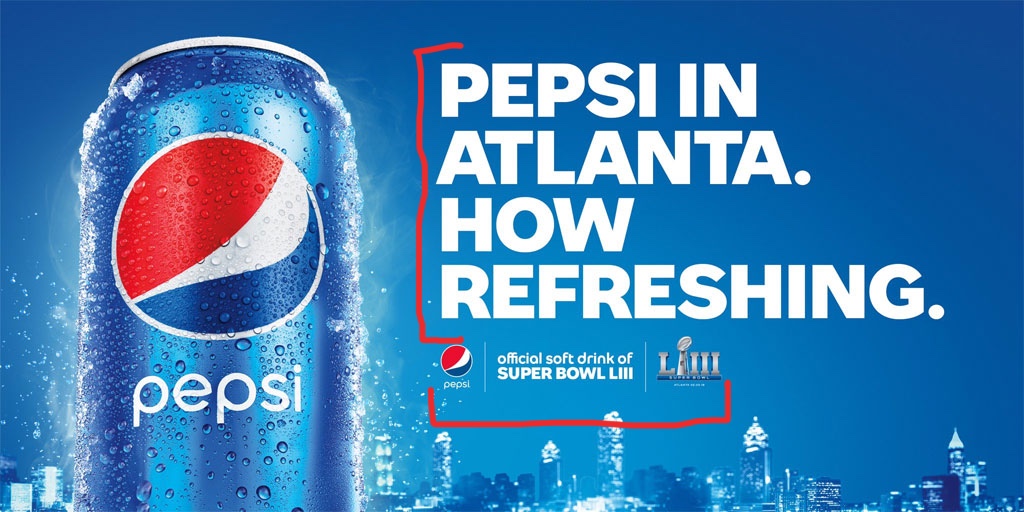
This one is so simple, but that’s what makes it great. The most important thing Pepsi wants you to look at is in big bold letters and in proximity to each other. Who is in Atlanta? Pepsi is. Who is refreshing? Pepsi. They also do a good job grouping the smaller details at the bottom which clearly displays what this ad is for.
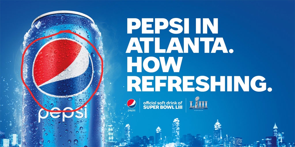
Everything is blue in this image except for the two most important things on the ad. First the Pepsi logo which stands out on its own with the big red area in their logo. It is what catches my eye when I first look at it and then I look at the white text against the blue background. I lets the viewer know what the ad is about immediately.
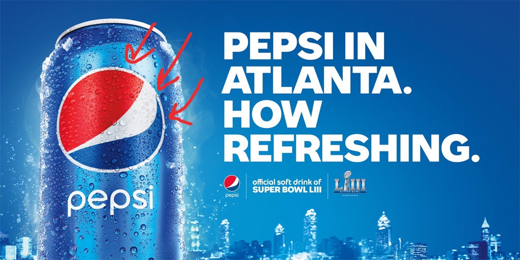
Their use of color in this ad is simple, but very effective. Since the Pepsi logo has a red area, they use it to their advantage to draw the viewer’s eye towards the logo. Although red is a very eye-catching color, it is subtle enough in this ad to complement the blue and white around it. The blue in this ad is the primary color, but they do a good job of balancing it out with white.
As expected from a company like Pepsi, their ad demonstrates all of the design principles and also uses them very well. The viewer’s eyes are not distracted by any impurities. It is eye-catching, clear, and bold.
This is an example post, originally published as part of Blogging University. Enroll in one of our ten programs, and start your blog right.
You’re going to publish a post today. Don’t worry about how your blog looks. Don’t worry if you haven’t given it a name yet, or you’re feeling overwhelmed. Just click the “New Post” button, and tell us why you’re here.
Why do this?
The post can be short or long, a personal intro to your life or a bloggy mission statement, a manifesto for the future or a simple outline of your the types of things you hope to publish.
To help you get started, here are a few questions:
You’re not locked into any of this; one of the wonderful things about blogs is how they constantly evolve as we learn, grow, and interact with one another — but it’s good to know where and why you started, and articulating your goals may just give you a few other post ideas.
Can’t think how to get started? Just write the first thing that pops into your head. Anne Lamott, author of a book on writing we love, says that you need to give yourself permission to write a “crappy first draft”. Anne makes a great point — just start writing, and worry about editing it later.
When you’re ready to publish, give your post three to five tags that describe your blog’s focus — writing, photography, fiction, parenting, food, cars, movies, sports, whatever. These tags will help others who care about your topics find you in the Reader. Make sure one of the tags is “zerotohero,” so other new bloggers can find you, too.