
This is an ad by Pepsi for the Super Bowl LIII that I chose because of it’s simple, yet great design qualities. I will be reverse engineering this ad to show them off.
Alignment
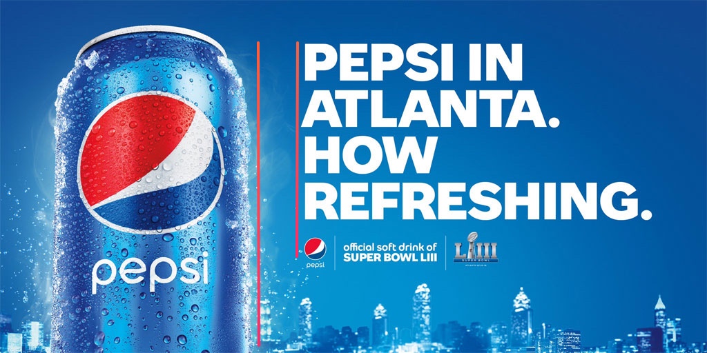
The alignment of the text on and the alignment of the Pepsi can creates an even white space making it easy on the viewer’s eyes. The text also makes their statement more bold instead of wimpy and it guide’s the viewer’s eyes down.
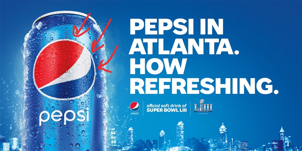
Repetition

The repetition of the periods makes the statement more bold. Pepsi wants the reader to believe it’s refreshing and they state that clearly and without a doubt by using periods in repetition.
Proximity
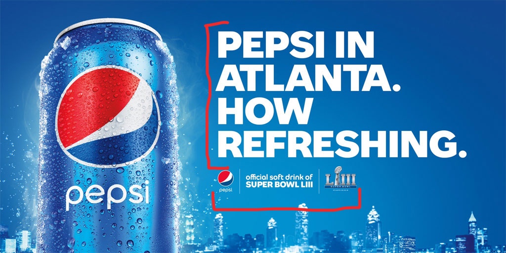
This one is so simple, but that’s what makes it great. The most important thing Pepsi wants you to look at is in big bold letters and in proximity to each other. Who is in Atlanta? Pepsi is. Who is refreshing? Pepsi. They also do a good job grouping the smaller details at the bottom which clearly displays what this ad is for.
Contrast
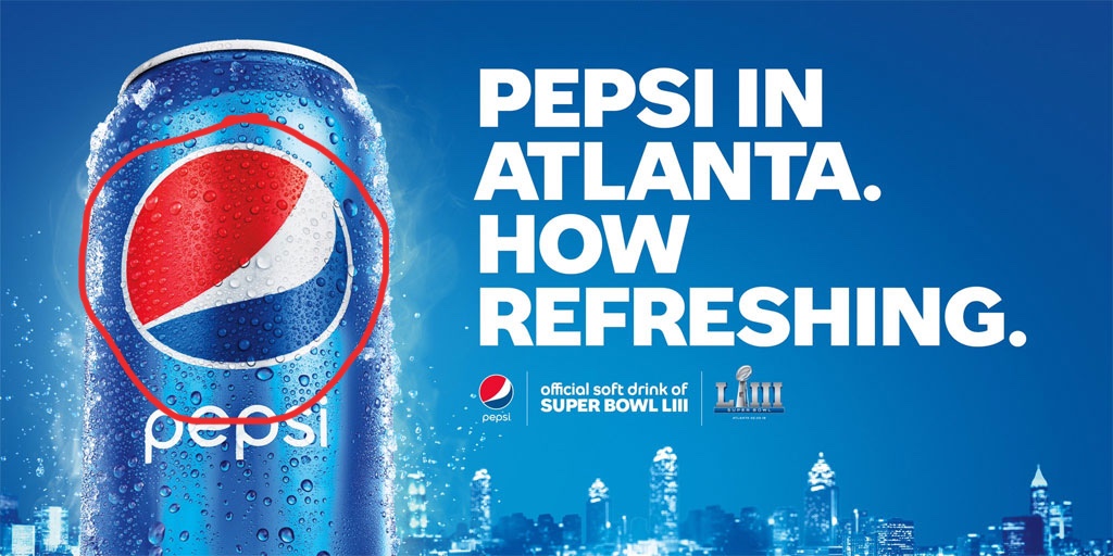
Everything is blue in this image except for the two most important things on the ad. First the Pepsi logo which stands out on its own with the big red area in their logo. It is what catches my eye when I first look at it and then I look at the white text against the blue background. I lets the viewer know what the ad is about immediately.
Color
Their use of color in this ad is simple, but very effective. Since the Pepsi logo has a red area, they use it to their advantage to draw the viewer’s eye towards the logo. Although red is a very eye-catching color, it is subtle enough in this ad to complement the blue and white around it. The blue in this ad is the primary color, but they do a good job of balancing it out with white.
As expected from a company like Pepsi, their ad demonstrates all of the design principles and also uses them very well. The viewer’s eyes are not distracted by any impurities. It is eye-catching, clear, and bold.
